Lintar olive oil
branding / rebranding / naming / packaging design / strategy / visual identity
The Mamić family from the town of Kaštela, owners of an olive grove on Mount Kozjak, has rich experience and knowledge in olive growing that guarantees high value and quality of olive products. Strongly tied to the local tradition, cultural heritage, and history of Kaštela, the family wants to contribute with their products to the development of the local community and tourist offering. The story of Miljenko and Dobrila, the Romeo and Juliet of Kaštela, belonging to the intangible local cultural heritage, is an important part and inspiration of the Mamić family, so the family’s restaurant and tasting room displays a local artist’s relief with this theme.
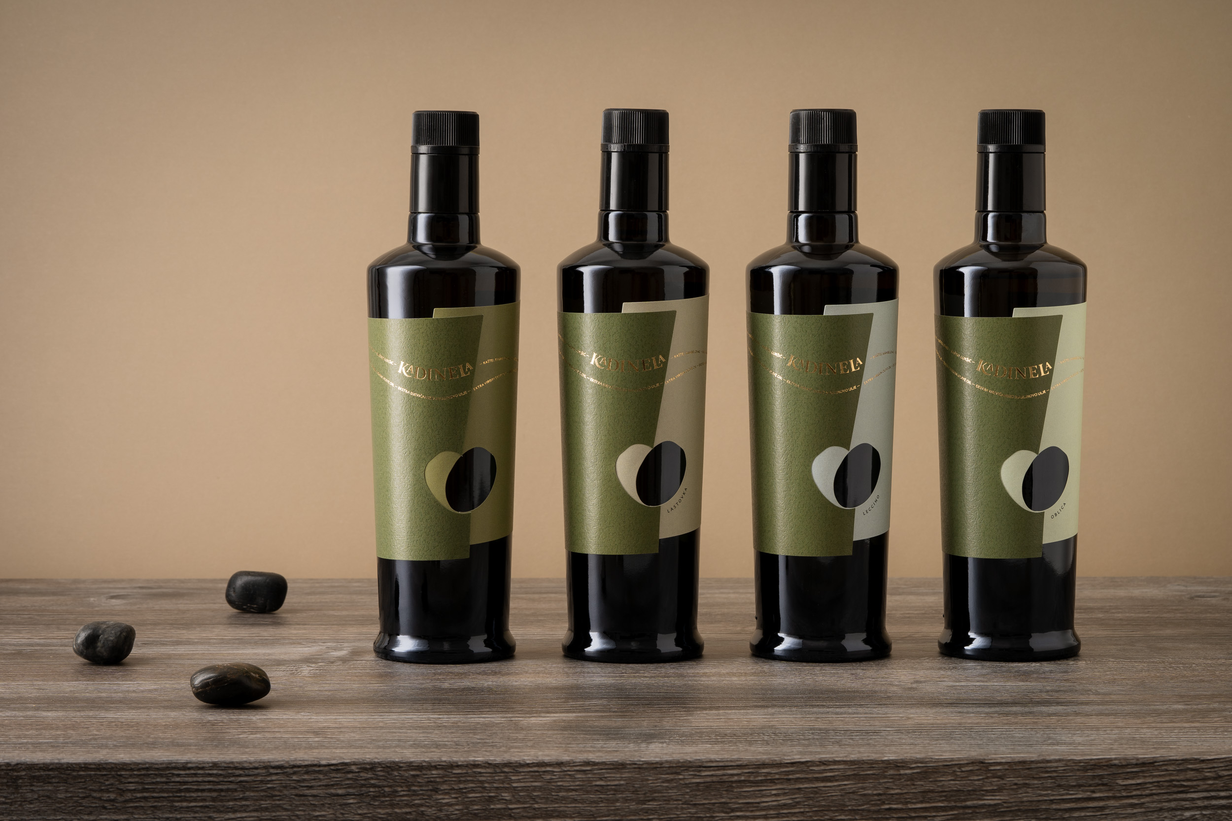
Kadinela is a brand of a group of olive products, primarily a line of extra virgin olive oil, other olive products, and natural cosmetics. The brand’s designed name – Kadinela, is an old word from the local dialect, meaning necklace. The melodious pronunciation is associated with Dalmatia, and the meaning is represented by the seven Kaštela lined up along the coast like beads on a necklace. The names of all the Kaštela that form a chain with the logo are an important part of the identity. The joining of two olives that overlap to form a heart illustrates the idea of “out of love”. So, the story of the love of Miljenko and Dobrila, and the union of two families of olive growers, gets a happy ending.
The basic element – a heart created by joining two olives – is rendered spatially on the label. The relation between the full and empty parts of the two folded labels brings a new dimension, and the different structures and tones of the paper emphasize the junction. Products within the varietal and flavored sub-line of olive oils are coded with pastel colors and names.
Style, typography, use of materials, and specific techniques give the identity a premium look, helping the product to function in modern times, and communicate to customers looking for higher-value products.
The digital version of the “olive heart” also creates a drop inside the heart shape by overlapping.