EDIT sustainable fashion
branding / rebranding / digital / 3D / motion / editorial / publications / visual identity
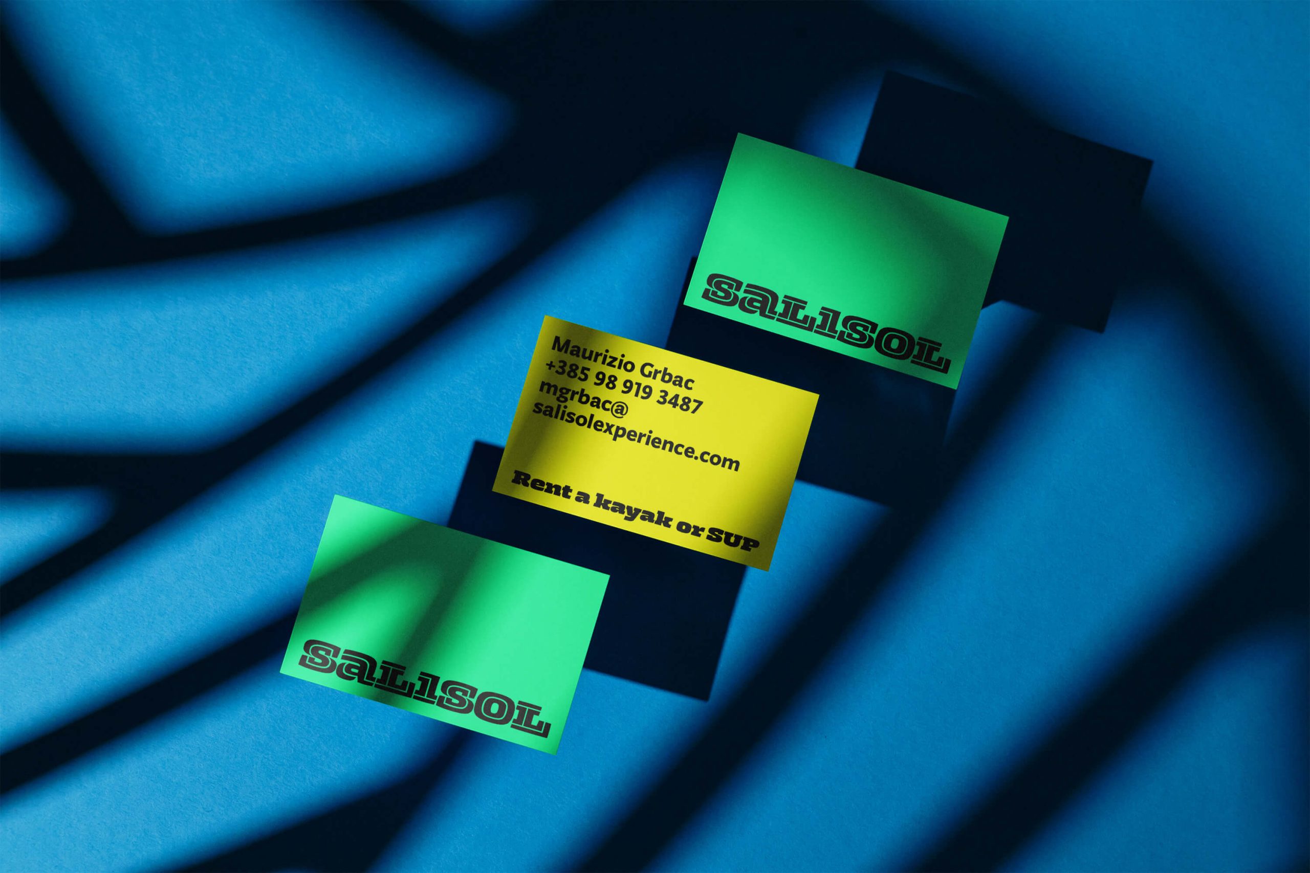
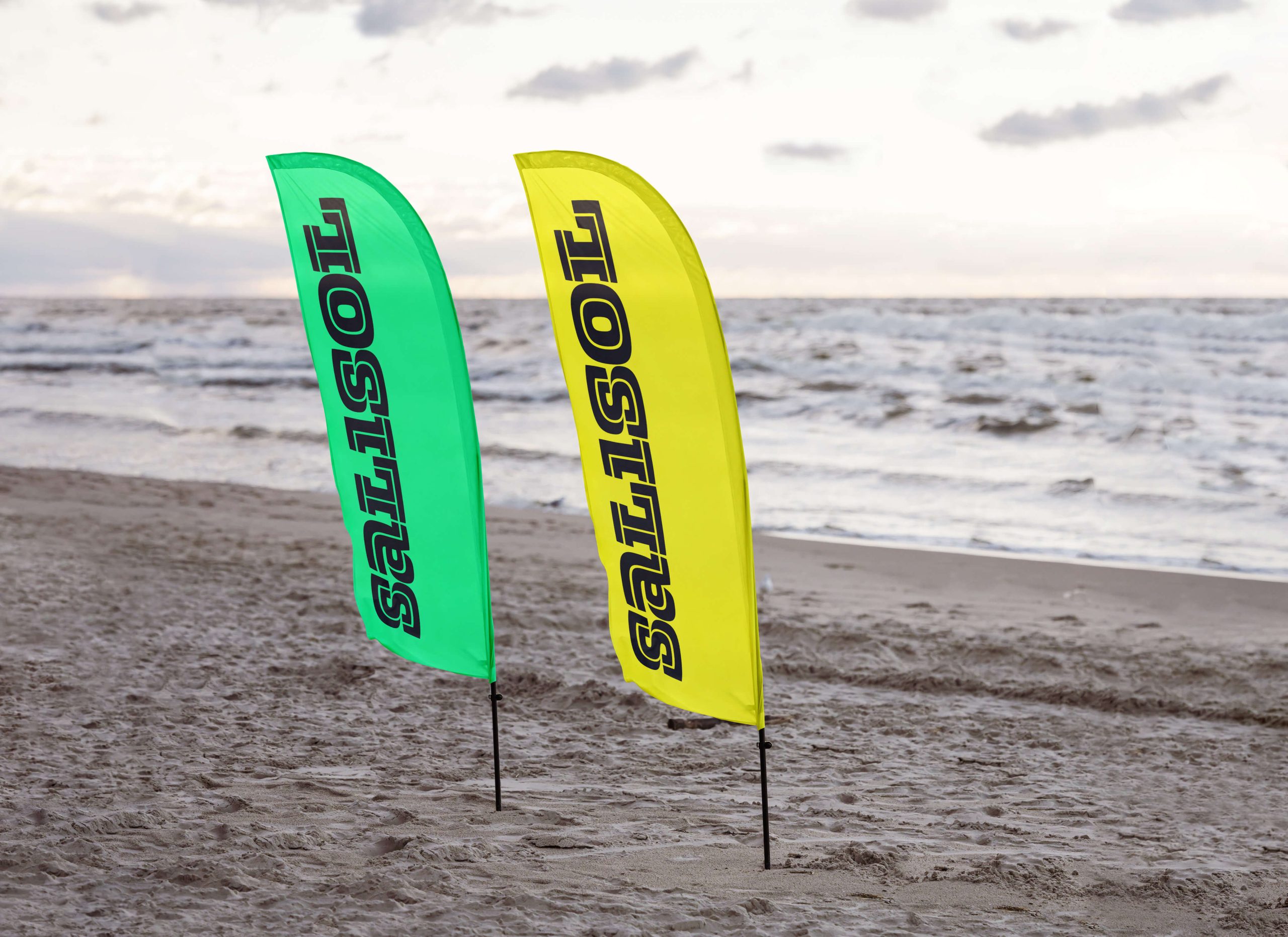
Salisol is a sports brand offering services in outdoor sports activities and active vacations, such as renting a kayak and SUP (standup paddleboard), guided active tours, yacht, speedboat, and sports sailboat rentals, as well as sailing schools and other sports activities at sea.
The name is coined from two words from the Venetian dialect one can still hear in Istria today: sal – salt and sol – sun. Salt and sun are strongly associated with summer and physical activities, exposing the skin to sun rays and covering it with salt from seawater dispersed by the wind or evaporated after swimming. A simple, short, and memorable name that sounds lyrical and poetic and gives the impression of the strength and dynamism of a genuine sports brand at the same time.
The identity is built on the principles of contemporary, active, sporty, and dynamic. A contrasting dominant logo carries the identity and appears as the “S” monogram in some applications. The typography Zico, created by Marko Hrastovec, draws inspiration from sports aesthetics.