
The spotlight on Fonts In Use kicks off with a compelling narrative: “When Željko Knežević and Matko Barun of fledgling distillery High Spirits planned to launch their premium gin, they realized that a superb packaging was needed to make some waves. Luckily they knew whom to turn to: Izvorka Jurić and her studio in Zagreb have repeatedly proven that they are a first class address for design that can make a difference.”
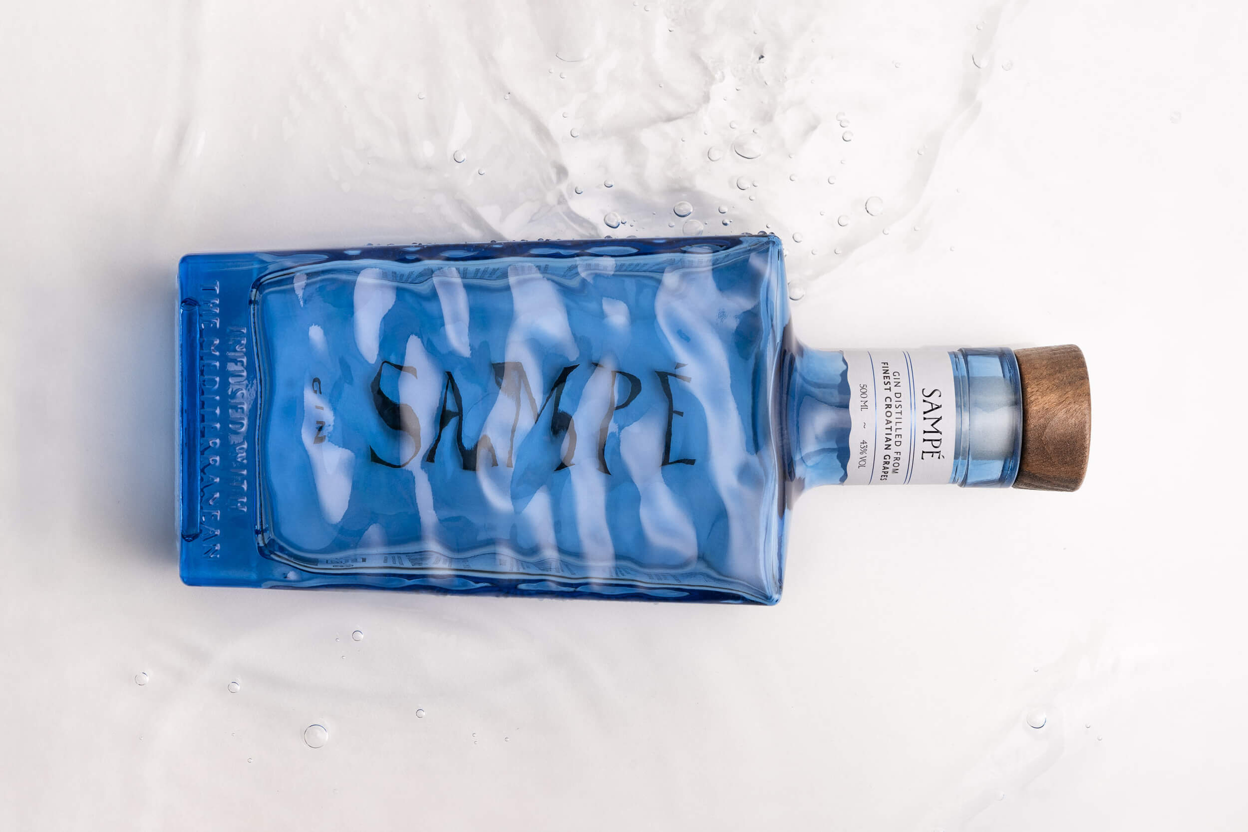
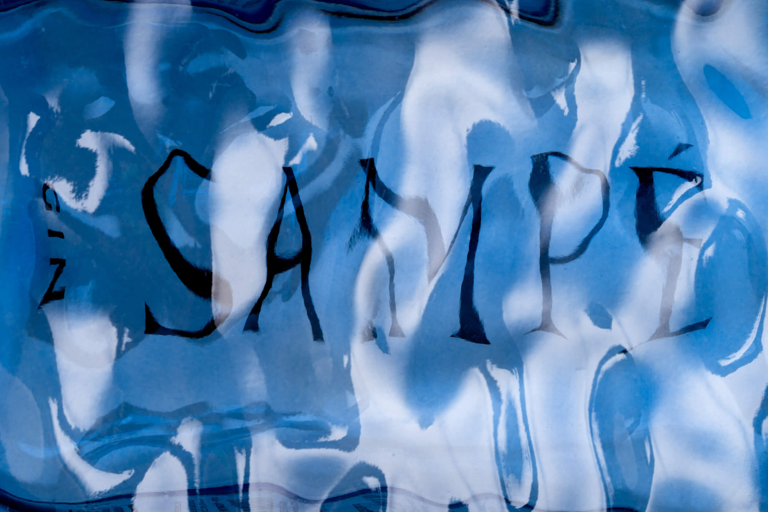
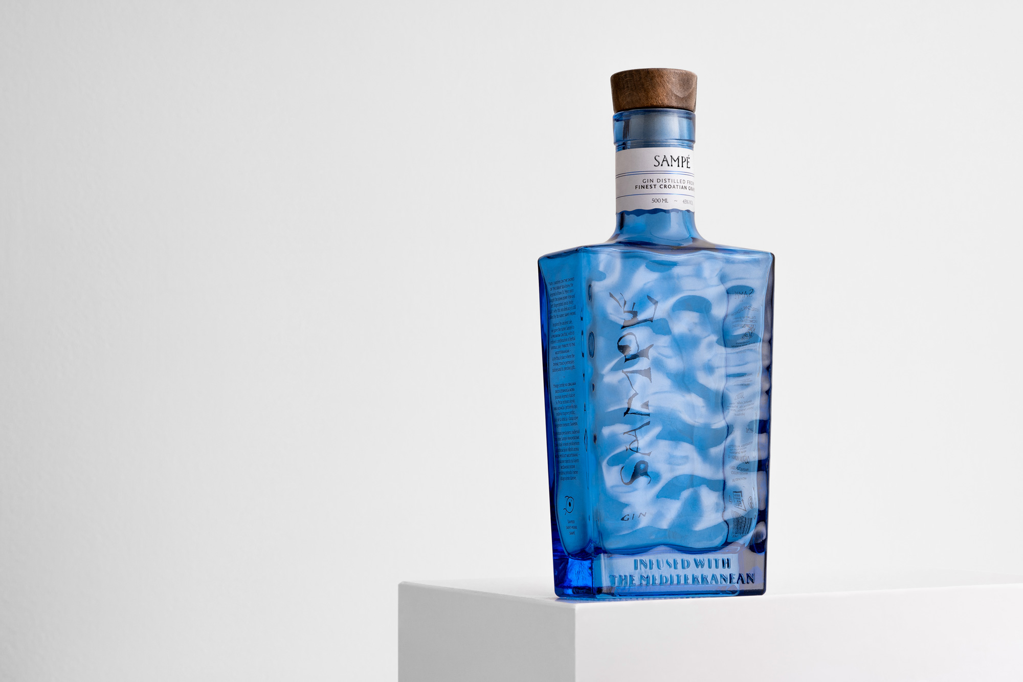
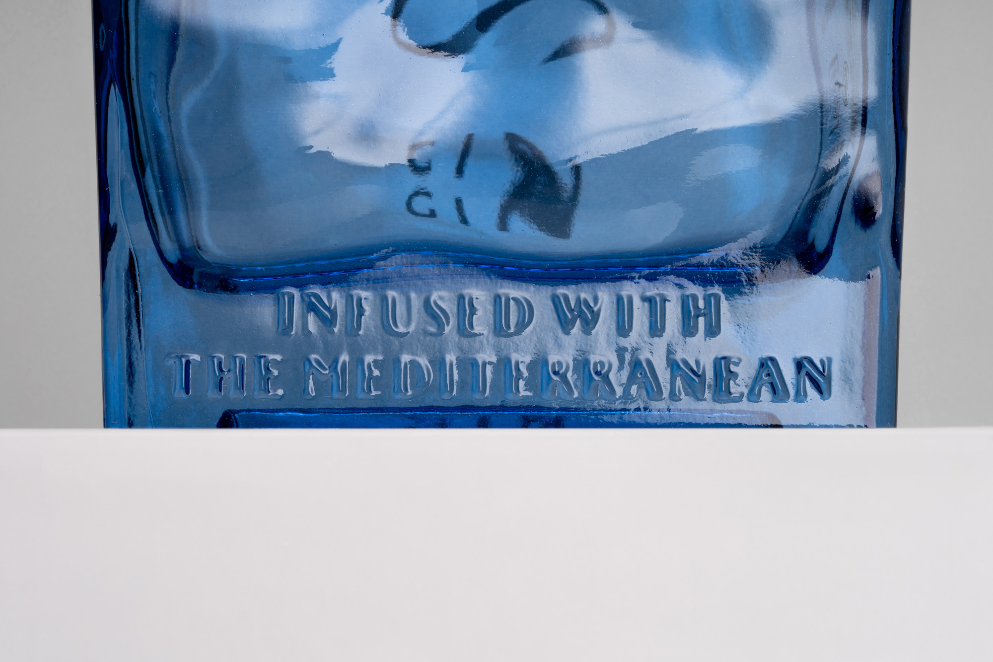
In their discussion, they emphasize the careful selection of typography: “For the typography, Jurić and Kos selected Rector “for the ideal combination of monumental and graceful”. The lapidary serif with sharply cut shapes and majestic capitals was designed by Hrvoje Živčić and published by Production Type. On the labels, Rector is contrasted with a sans serif by another Croatian type designer: Nikola Djurek’s Brioni Sans, available from Typotheque.”
Check out the post on Fonts In Use.
SAMPÉ gin is a strong alcoholic drink distilled in Croatia.


