
Wolda (Worldwide Logo Design Award) is an international competition for the design of signs, logos, identities, print materials, and packaging, presented in seven categories: design of a new sign/logo, redesign of a sign/logo, design of an animated and audio sign/logo, flexible identity design, corporate identity design, corporate identity design with typography design, and sign/logo design within the context of packaging.
For the 13th WOLDA competition, entries were submitted from as many as 33 countries, and the international judging panel this year comprises distinguished designers from Japan, Luxembourg, Denmark, the Netherlands, Hungary, Australia, and the USA.


TREF logotip
WOLDA 13 Gold Award – New logo
TREF is a premium lager beer designed for young people who enjoy naturally produced light beers. Playing cards and their vertical symmetry naturally emerge as a direction. As a result, the brand is designed as a logo in the form of an ambigram – a designed word that reads the same when turned upside down. The design conveys associations with phrases like ‘you’ve got a good hand,’ or ‘lucky deal,’ and eternal optimists who alwayshttps://dig.studio/portfolio/tref-premium-lager-beer/ see the glass as half full and only lose in poker if they don’t have a good time will identify with the slogan ‘Whichever way you turn.’


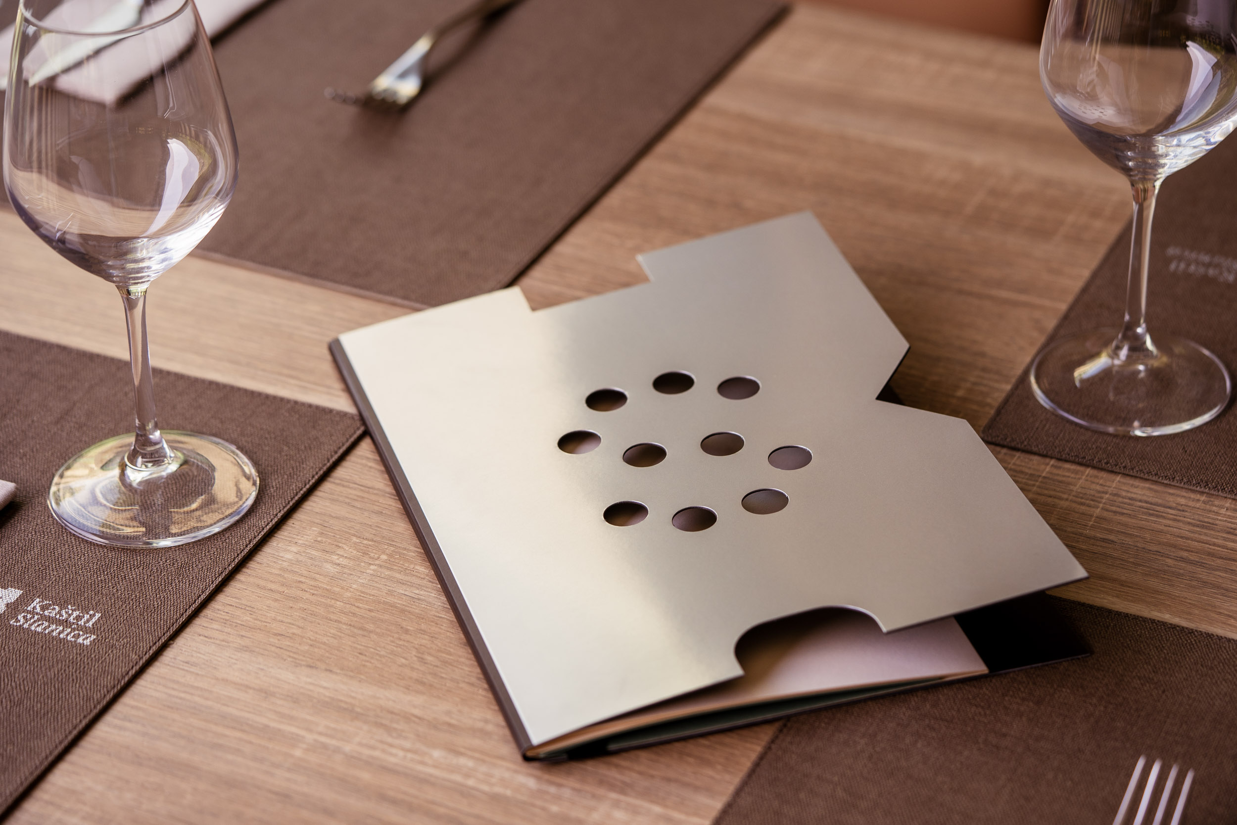
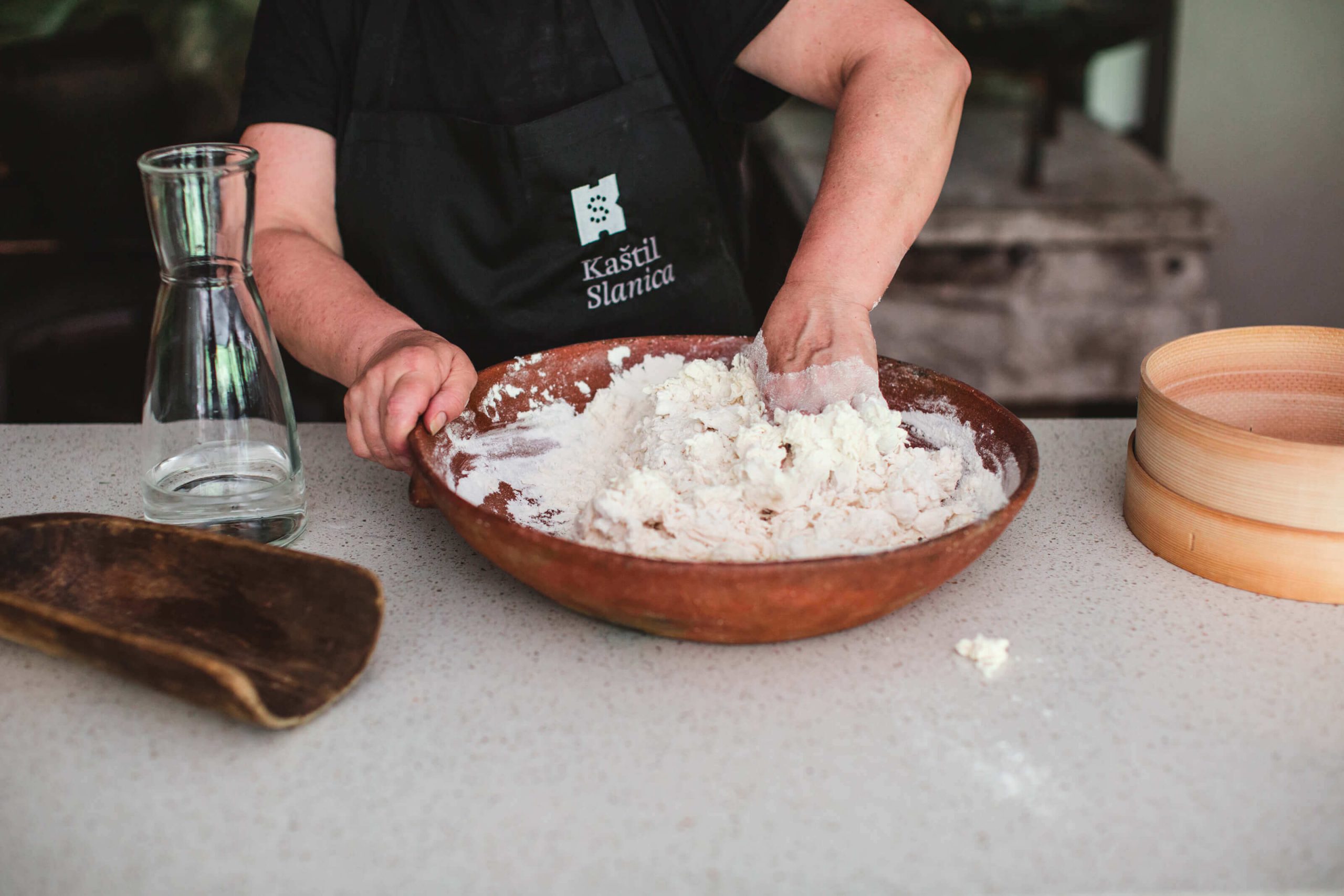
Kaštil Slanica rebranding
WOLDA 13 Gold Award – Logo redesign
Kaštil Slanica is a family restaurant with over 25 years of tradition. The goal of this rebranding is to define a new verbal and visual identity that communicates the restaurant’s values at a higher premium level, blending tradition with gastronomy. The restaurant is located on the family’s ancestral land, an old fortress, and a salt market from the 16th century, accessible by river, sea, and land routes. The symbol motif retains the existing motif – Kaštil, adding an element of association with salt – Slanica, and salt cellars as associations to the culinary offering – the restaurant.


“Šapica” Association
WOLDA 13 Silver Award – Logo redesign
The primary mission of the “Šapica” Association is to care for animals, primarily dogs and cats, and to find individuals willing to adopt them. The redesign of the visual identity emphasizes the love for animals and the fact that the connection with an animal should last forever. The communication inspiration comes from a phrase commonly used by the Association’s staff when a dog and its adopter meet: ‘We hope they’ve found their forever friend.’


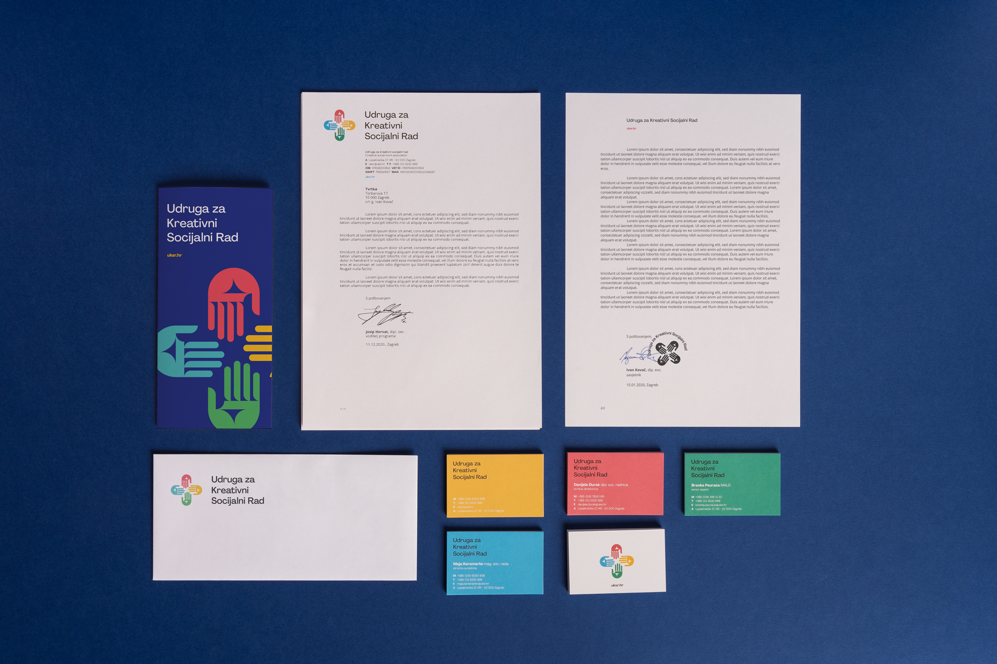
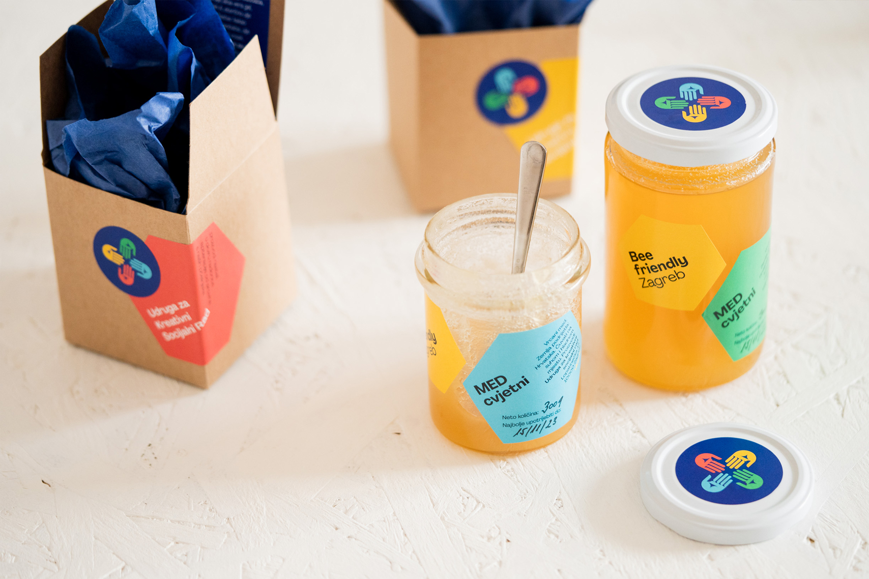
The Creative Social Work Association
WOLDA 13 Award of Excellence – Logo redesign
The Association for Creative Social Work provides support to clients during challenging life periods. This includes providing psychosocial assistance and support, addiction prevention and promoting a healthy lifestyle, active involvement in professionally helping addicts achieve lasting abstinence, assistance in integration, and educating vulnerable groups in society, among others. The redesign of the visual identity retains the core motif – hands, but they are now oriented towards each other and together form a cross shape, communicating support and assistance in crisis situations, which is the foundation of the Association’s work.


