Fjori Fôra natural products
branding / rebranding / copywriting / storytelling / naming / packaging design / strategy / visual identity
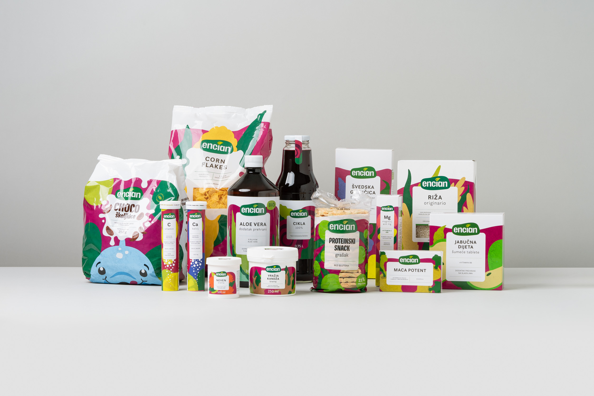
Encian is one of the pioneers of healthy nutrition in Croatia, offering more than 100 products, from dietary supplements and healthy food to cosmetics and household products.
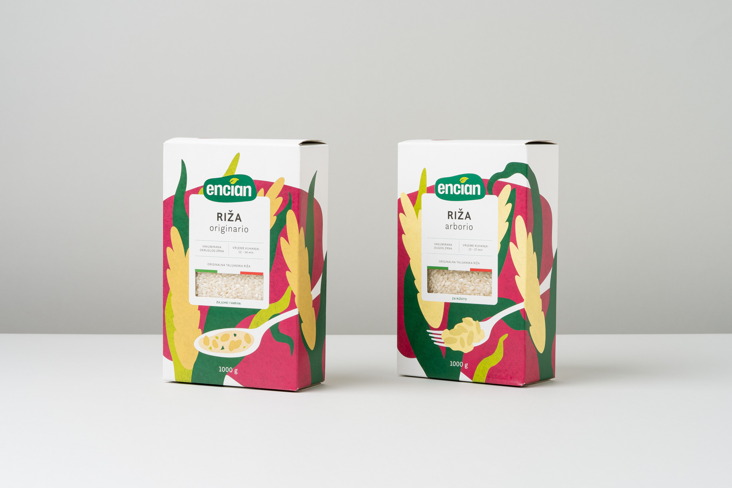
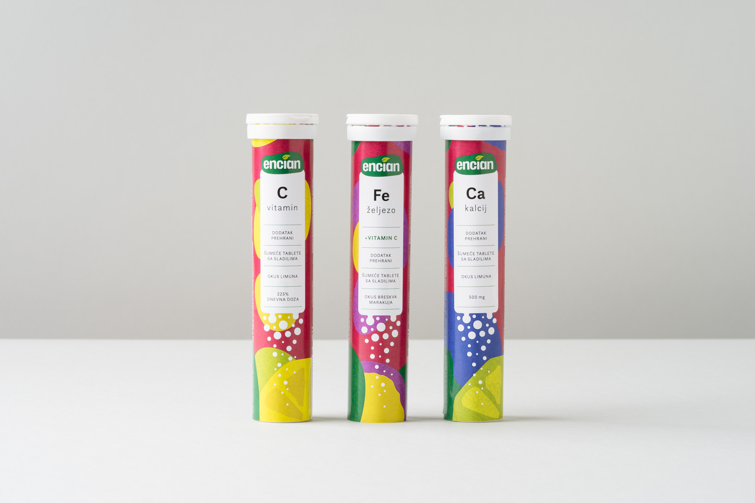
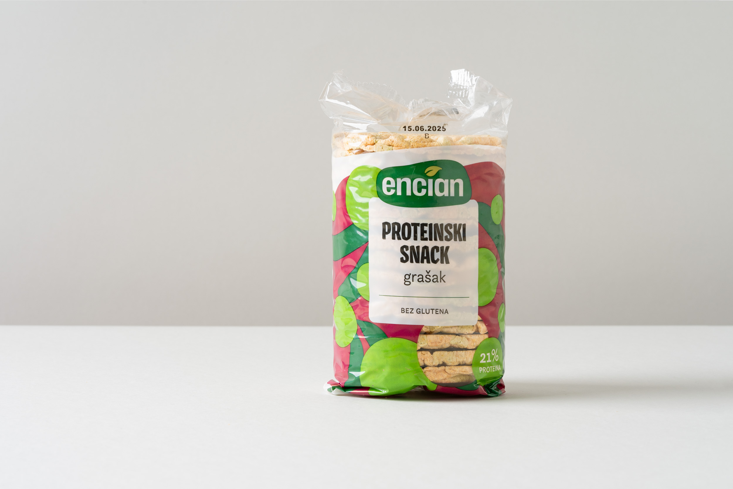
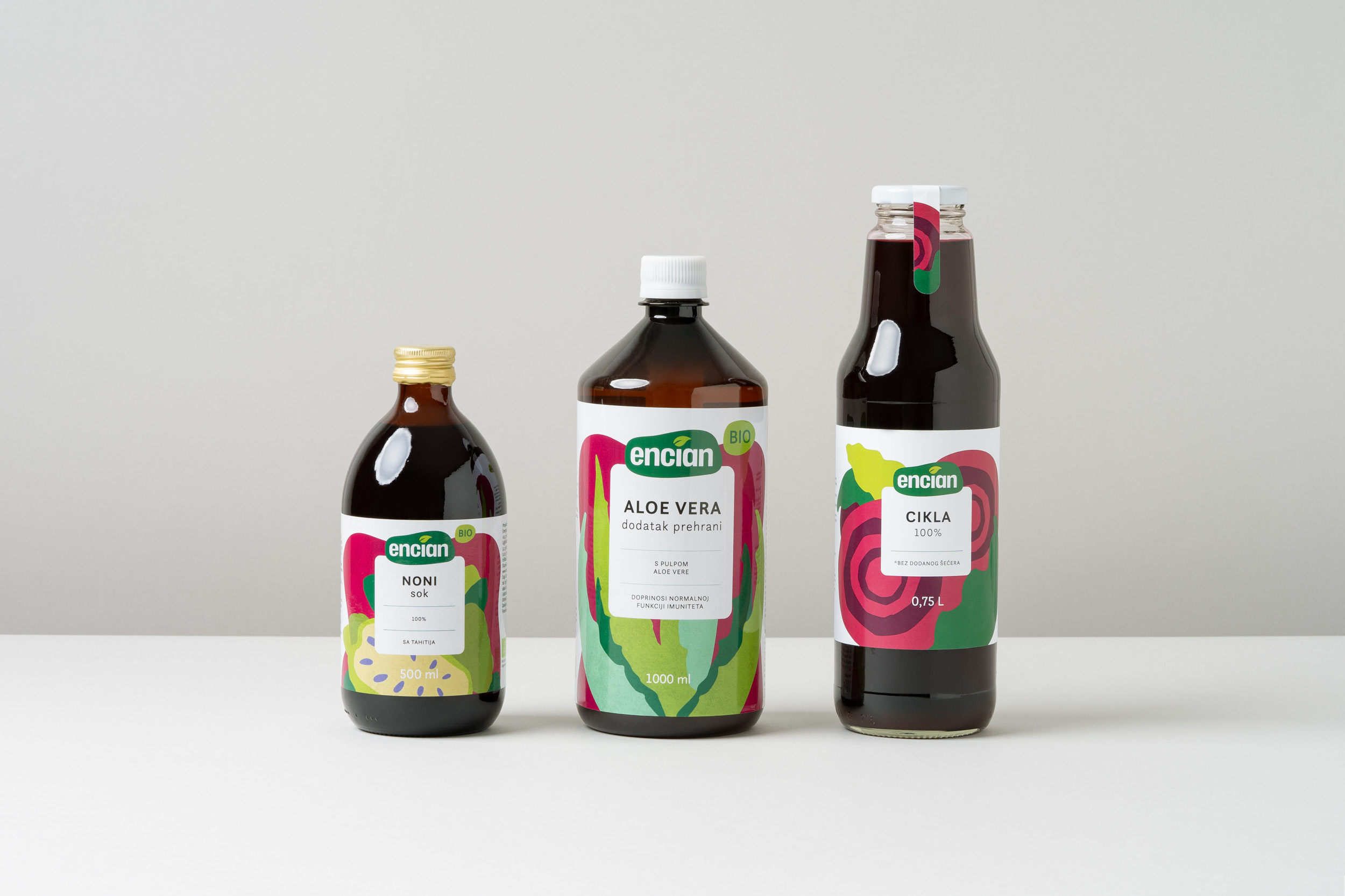
98% of sales take place in physical retail stores, but the products are distributed across different shelves within the same store, reducing the brand’s strength and visibility. The existing visual system was inconsistent, with uneven communication and no clear brand identity. Packaging varied in colour, materials, typography, and design approach.
The challenge of this rebranding was to reorganise the brand architecture and redefine the visual identity to position Encian as an accessible, modern, and relevant choice for today’s consumers, without losing the trust of its existing audience.
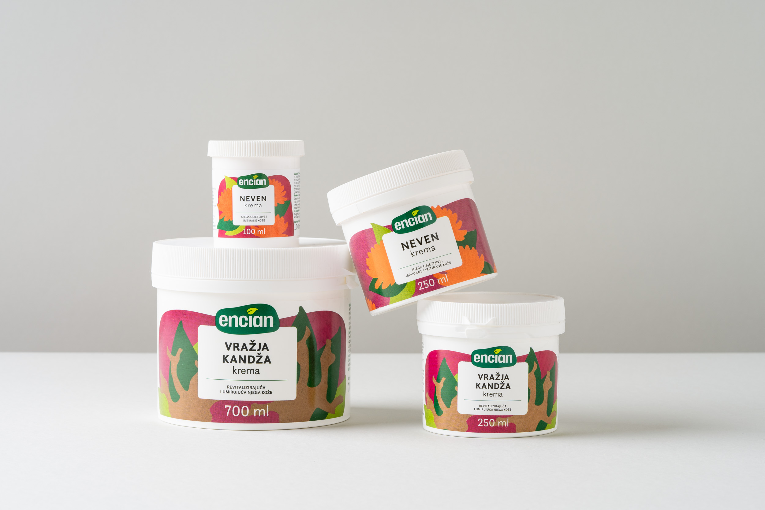
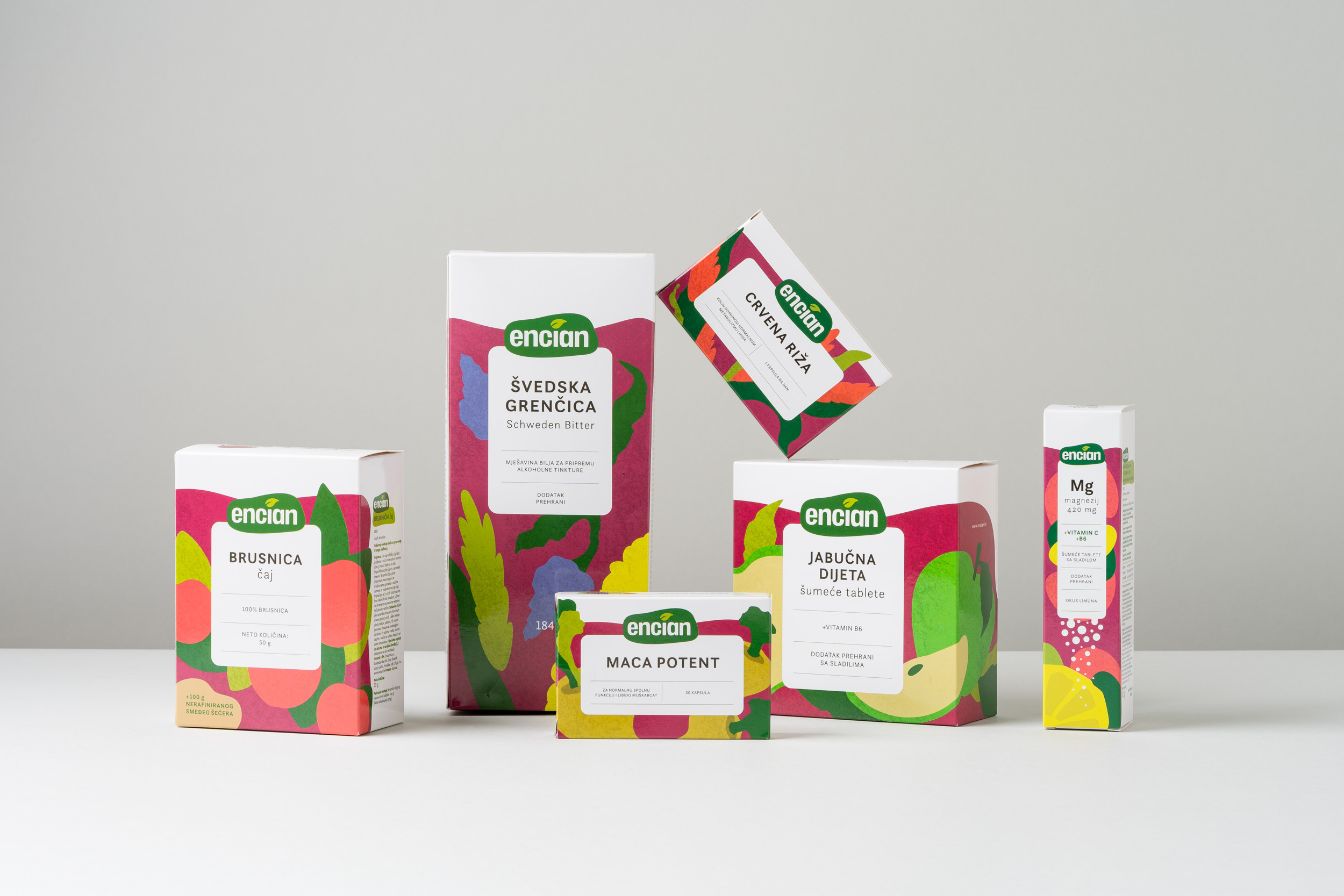
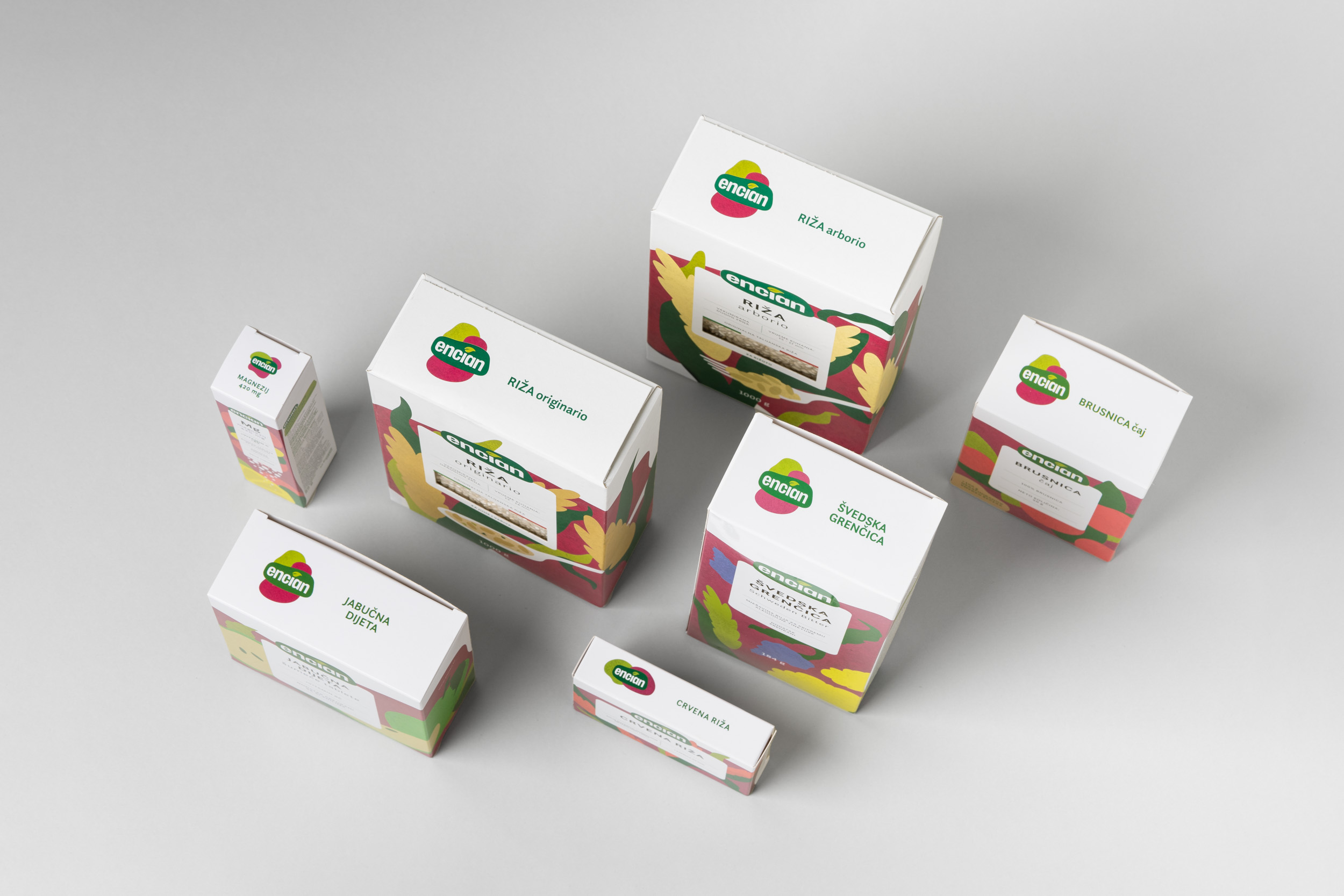
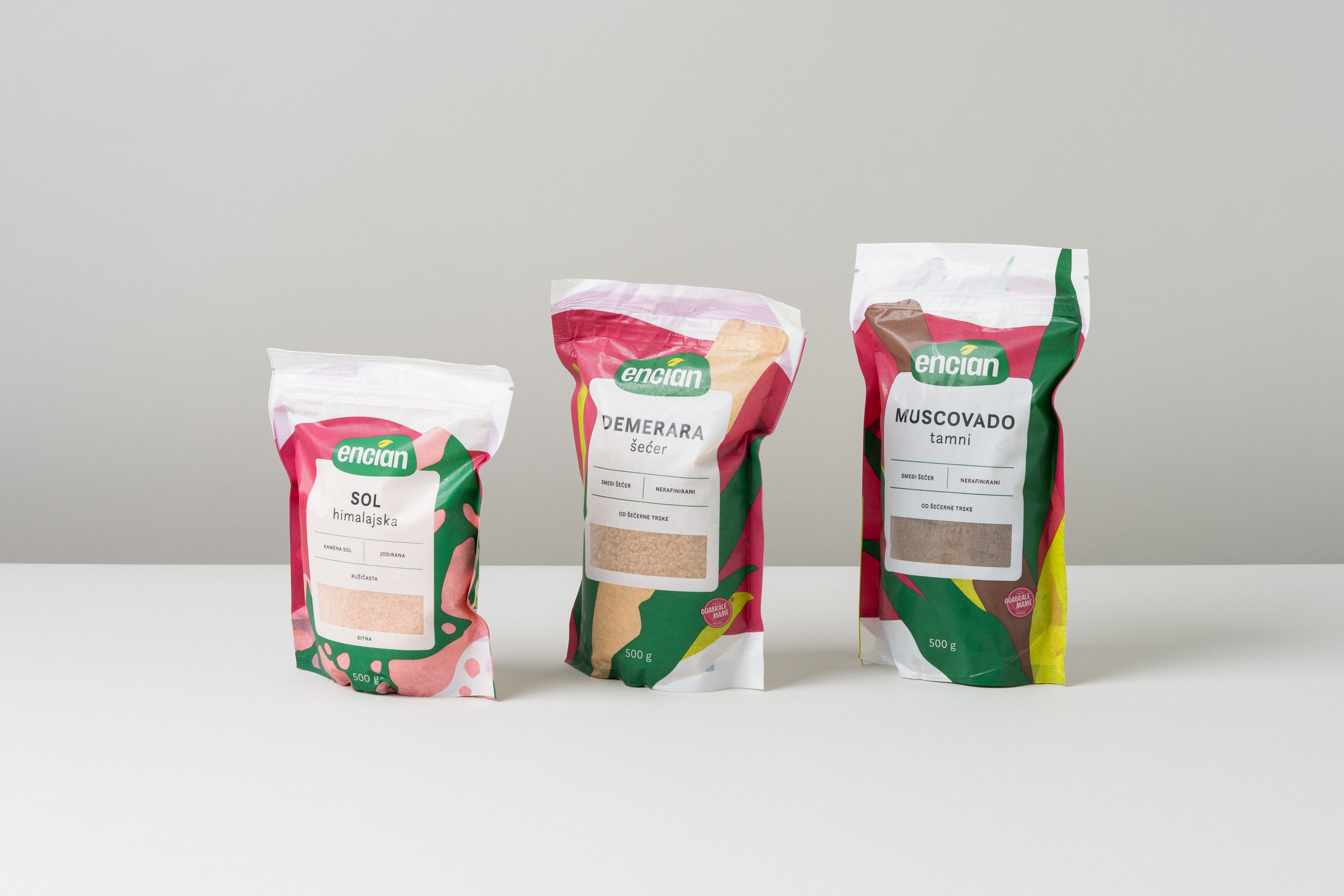
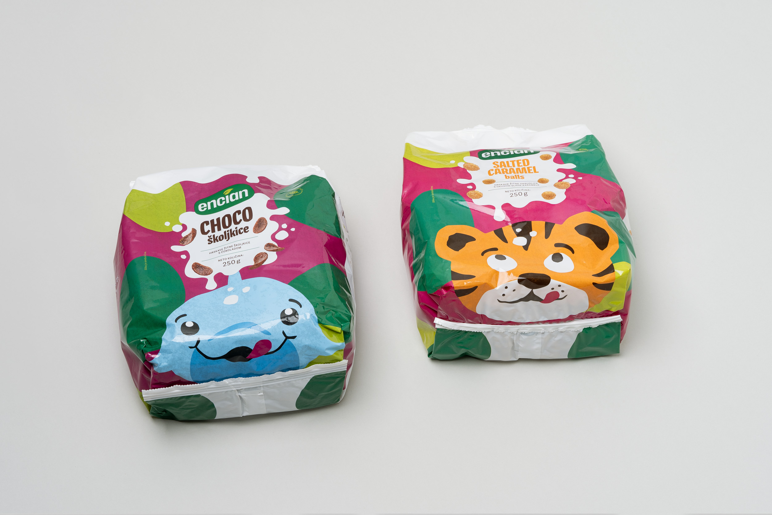
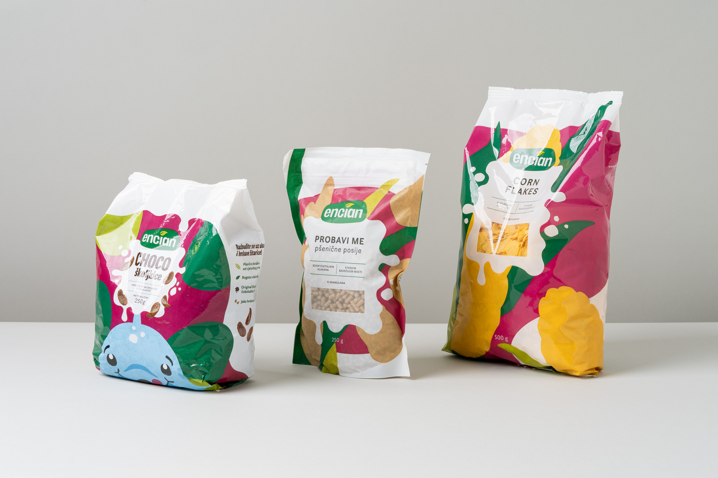
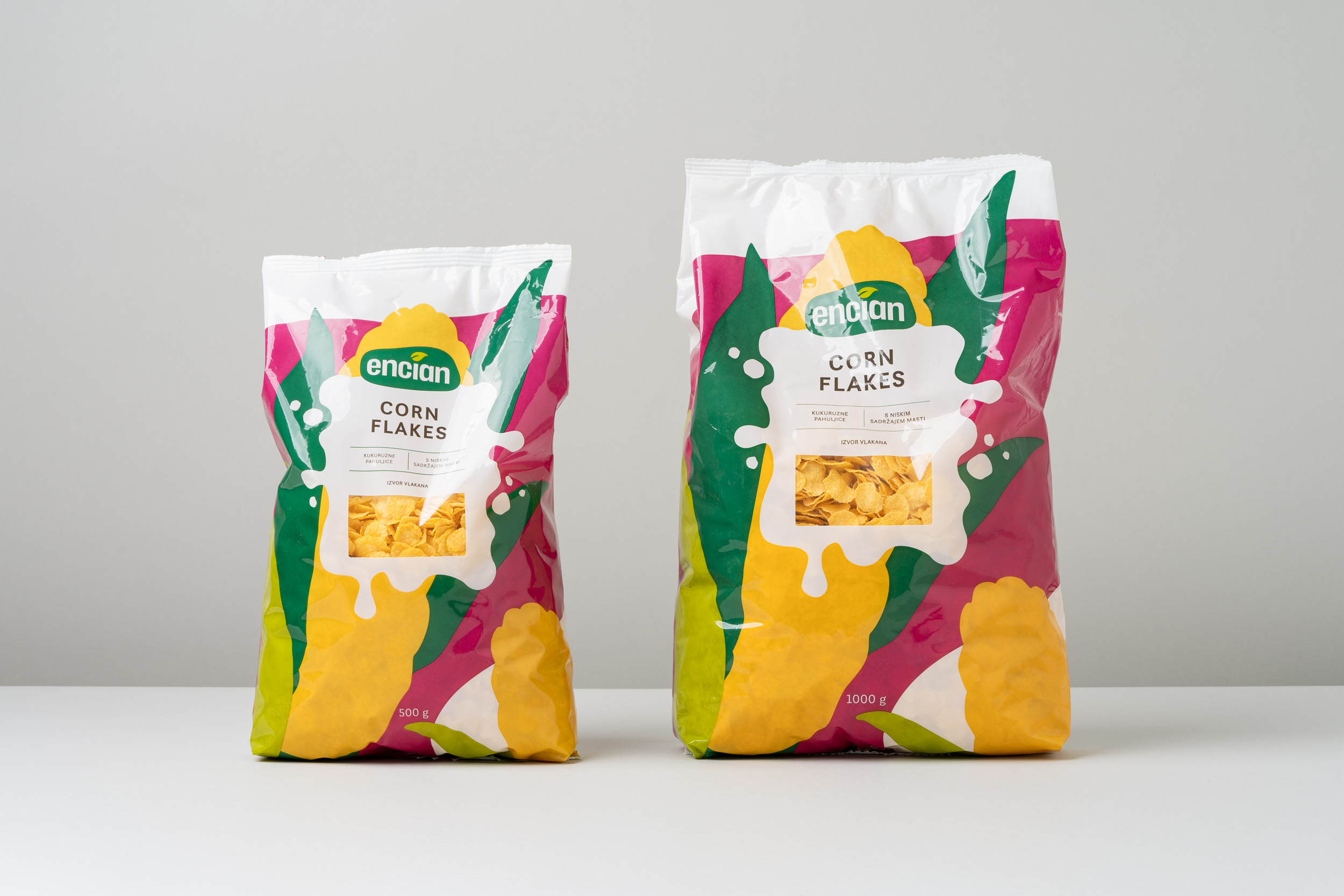
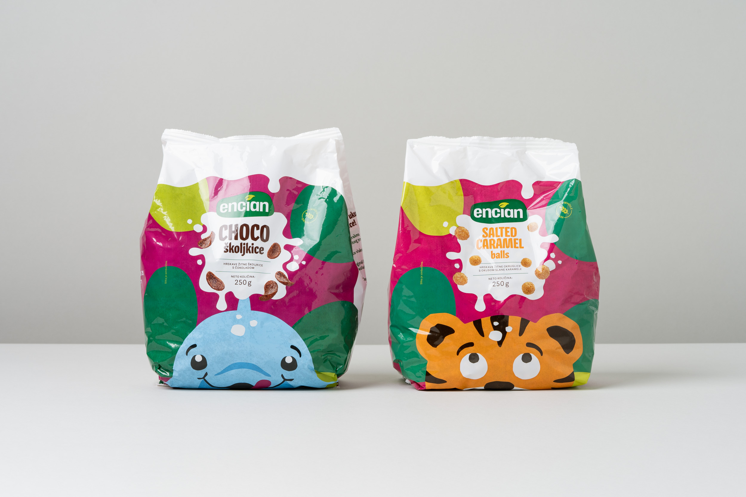
A new brand architecture was created with clearly defined product lines and sublines. A cohesive identity system was established, connecting the brand and its products within a consistent and recognisable framework. The colour palette and typographic system were modernised and simplified, while key brand elements were retained, refined, and strengthened.
The result is increased brand recognition and visibility at retail points, a clearly structured product portfolio, and a stronger visual identity that distinguishes Encian from its competitors and provides a foundation for the brand’s future growth and communication.