Next Level Naturals
naming / packaging design / product identity
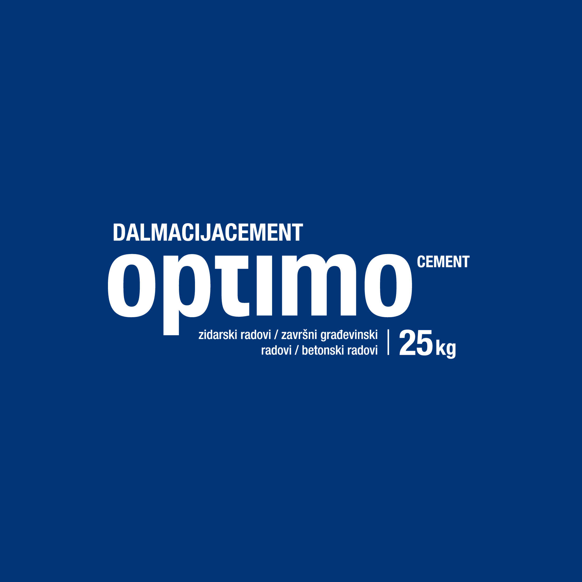
CEMEX Croatia needed a new, different, and strong visual identity for the cement products line. The visual identity had to clearly communicate the different characteristics of each product and those characteristics had to be visible in all additional materials.
The logotypes are designed by an intervention in typography and the illustrations are designed from lines and colors that are the basis of CEMEX visual identity.
The basic graphic element on the packaging are illustrations of building objects that clearly communicate the purpose of the product: house for Optimo – cement primarily intended for personal use and small craftsmen; tunnel for Strukto – a cement primarily intended for more complex construction works; modern building for Bijeli (Croatian for white) – as the white cement is often used in modern architecture, and bridge for Sulfacem – cement primarily intended for buildings exposed to aggressive environments (water or mud).
Considering the characteristics of the product and the material of the packaging – paper with a protective layer – the solution had to be adjusted to the technical limitations of printing in terms of color, surfaces, printing, and raster.