

Croatian Mint’s "Contour Necktie"
copywriting / storytelling / packaging design
The task was to design a product line of commemorative gift medals for the Croatian Mint, intended for occasions such as weddings, births, graduations, confirmations, and other important events in our lives. The project also involved the design of individual product lines, overall communication, and packaging suitable for different gift medals, adding value to the products and making them attractive to a wider audience beyond traditional collectors.
The creative concept is based on the traditional and poetic idea of “A Day to Remember”, interpreted in a contemporary and subtle way. Symbols associated with individual events, such as intertwined wedding rings or a dove’s wings, are integrated into a graphically stylised cross-section of a tree trunk. Tree rings, or growth rings, symbolise life and mark precise moments in time. Just as important events remain forever recorded in our memories, the passage of time is recorded in the rings of a tree.
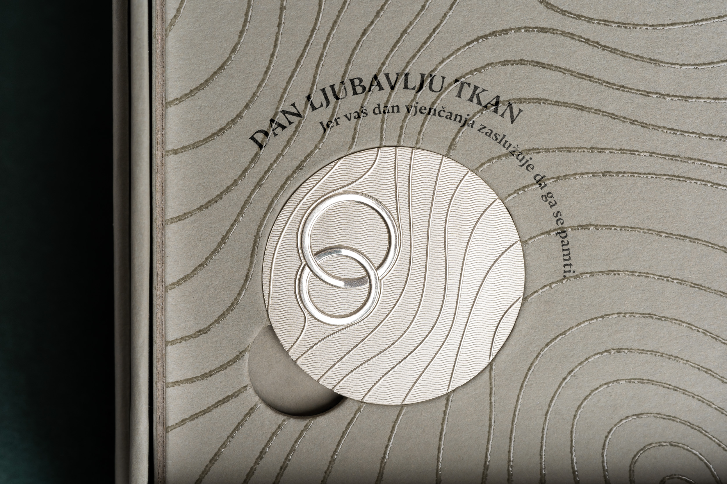
The medal design merges with the graphic on the display stand inside the packaging, making the packaging an integral part of the product and creating a complete gift experience. The front of the medal features a contemporary interpretation of a motif representing an important moment in life, its three-dimensional form emerging from the lines of the tree rings that continue across the medal. The back of the medal is intended for personalisation. The design combines contrasting glossy and matte surfaces with subtle engraved textures.
The messages featured on the products include: “A day given to the spirit. For the day of your holy confirmation deserves to be remembered” and “A day woven with love. For the day of your wedding deserves to be remembered.” In this way, the packaging itself becomes the primary carrier of the message associated with an important day in life, rather than merely a wrapper for the gift medal inside.

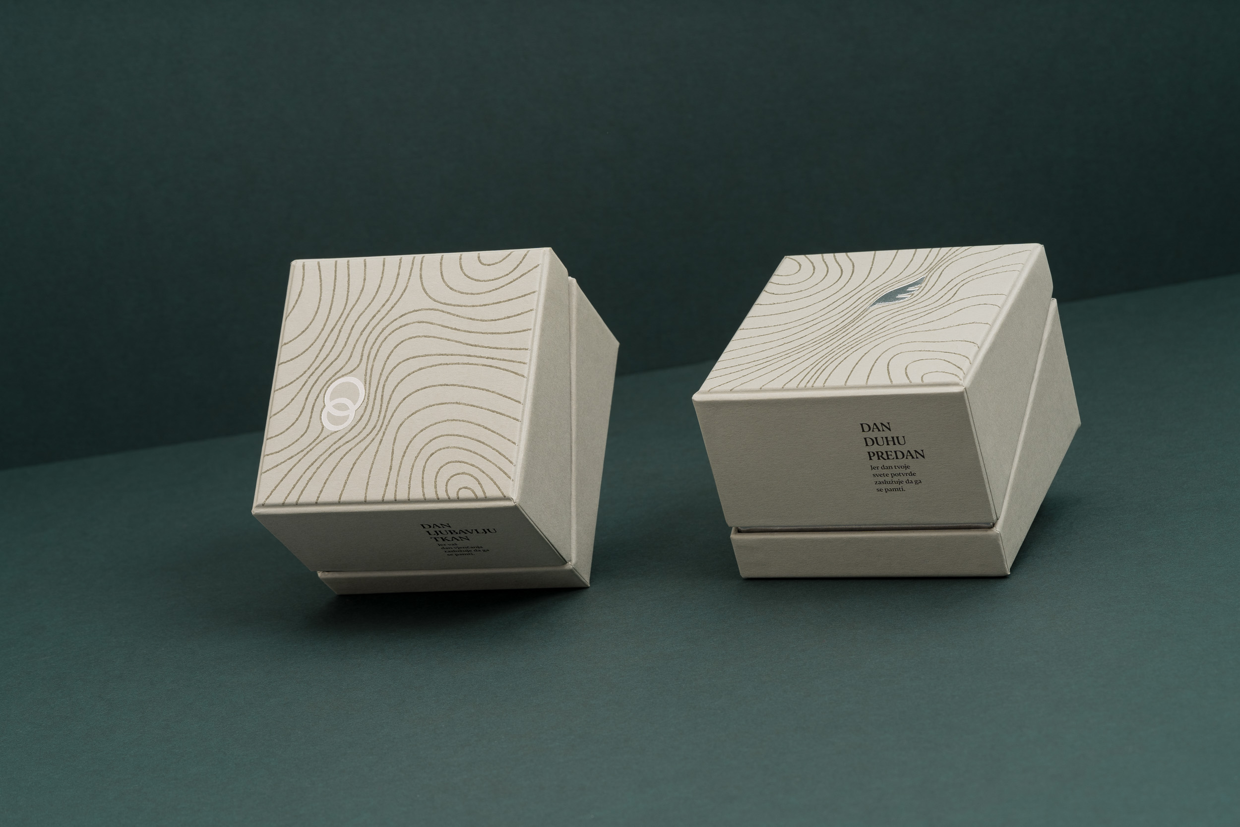


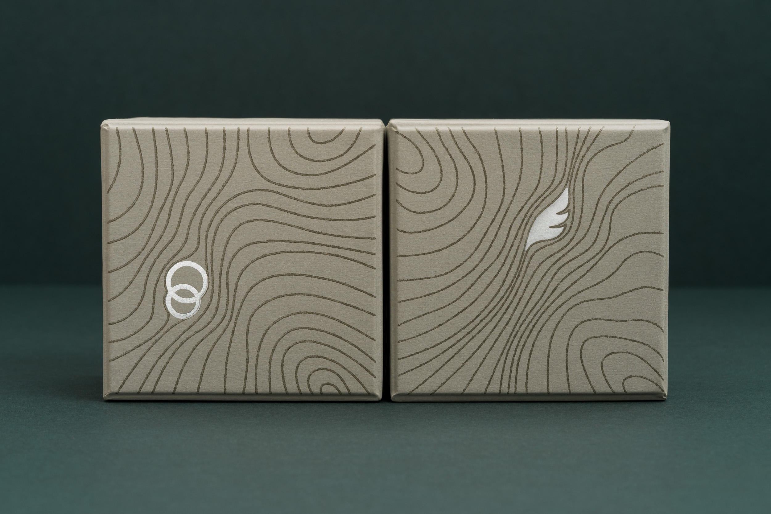

The packaging combines a gift box and a display package in a single solution. It consists of a rigid box with visible silver or gold details, depending on whether it contains a silver or gold medal. The packaging combines offset printing, thermography for a tactile effect, and hot foil stamping, with silver or gold foil indicating the type of medal inside.


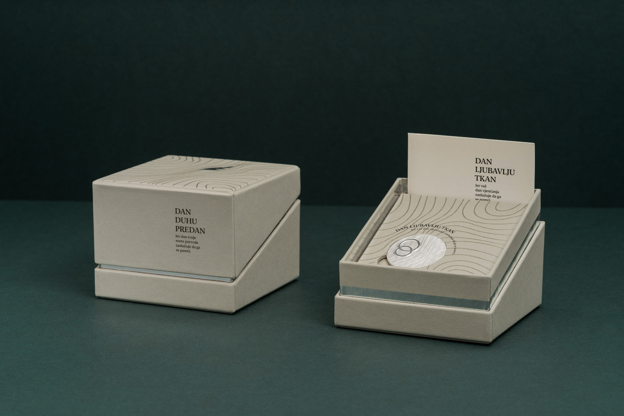
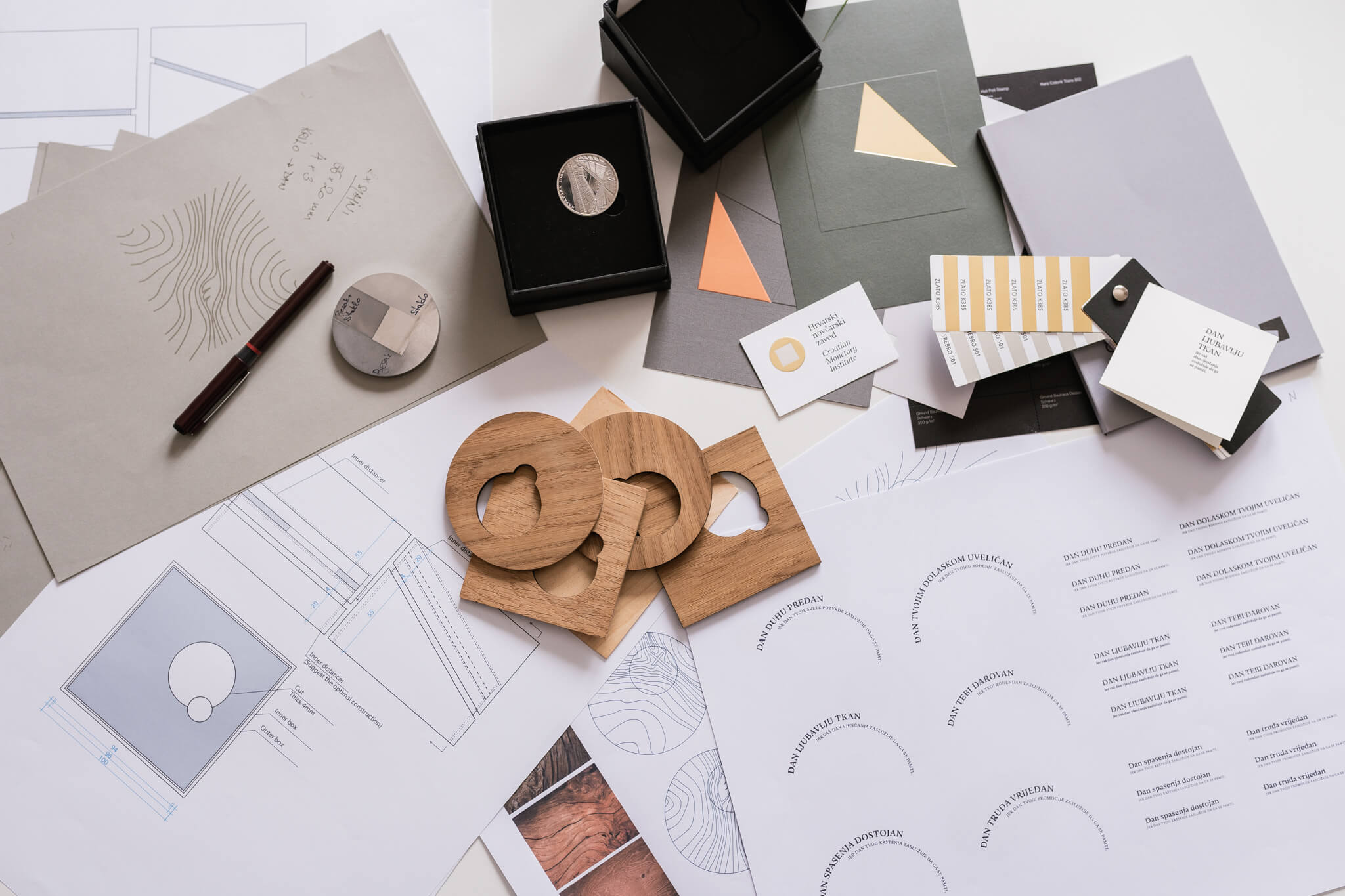


The packaging development process involved researching different shapes, constructions, and materials for the box. The design focused on creating functional display packaging with an angled presentation base. Wooden base prototypes were also developed as proposals for limited editions.
The process also included extensive testing of different typefaces, both for the packaging design and for medal personalisation, where specific technical requirements had to be met.


The front of the medal features a contemporary interpretation of a motif representing an important moment in life. The motif’s three-dimensional form emerges from tree-ring lines that continue across the medal. The back of the medal is intended for personalisation. The design combines contrasting glossy and matte surfaces with subtle engraved textures.


